The foundations of Living Colors as experiential architecture.
These principles describe the design logic of Living Colors. Each shapes the relationship between the system and the people who move through the spaces it inhabits — supporting restoration and ease in high-performance workplaces.
Soft Fascination
Describes a particular quality of attention — gentle and effortless, like the way the mind engages with rustling leaves, a flickering fire, or watching the ocean. Unlike the directed focus required by meetings, screens, and complex decisions, this quality does not deplete; it restores.
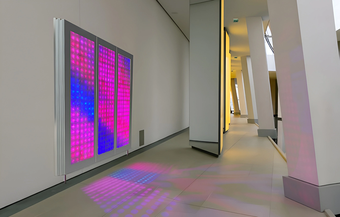
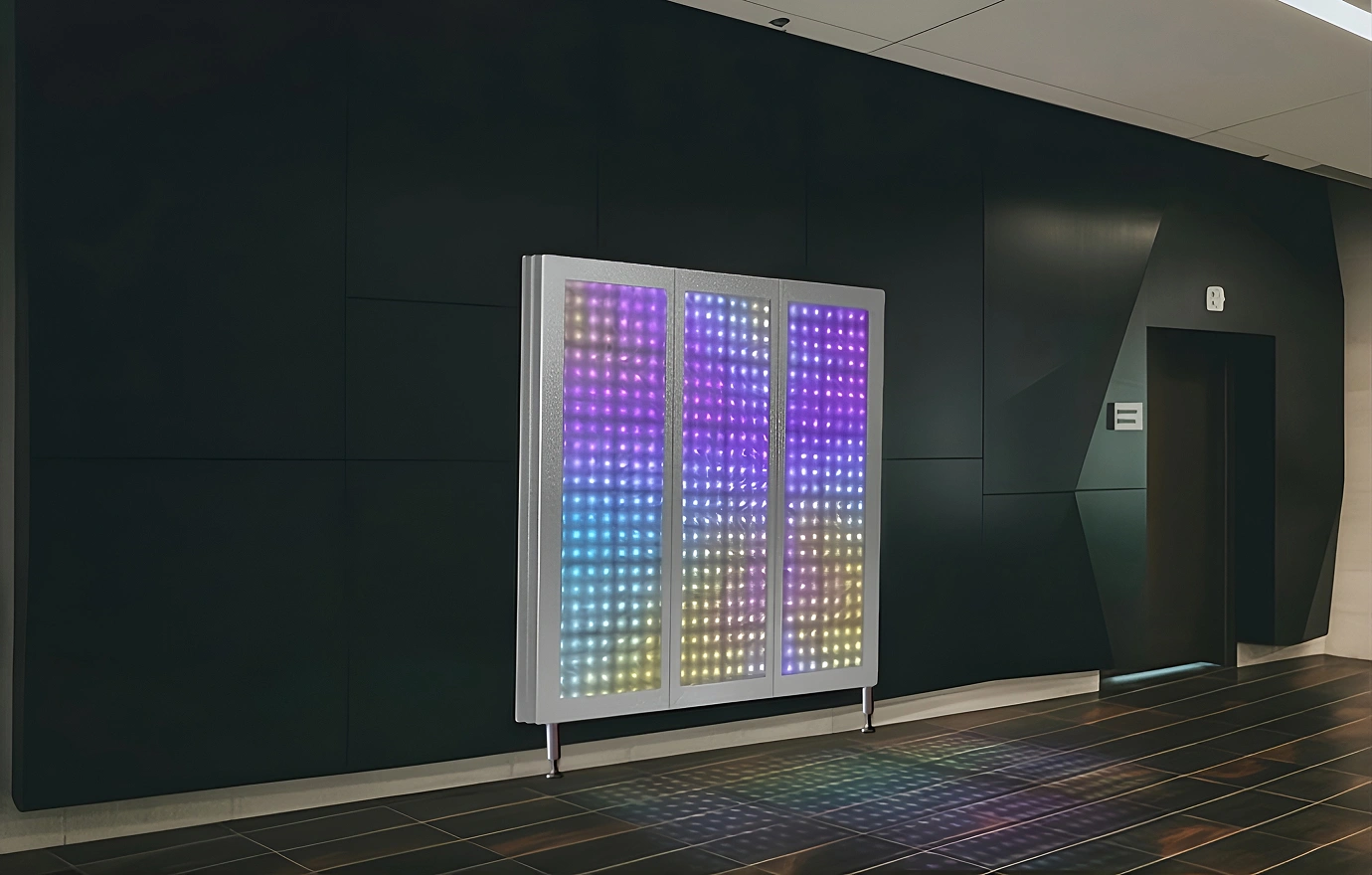
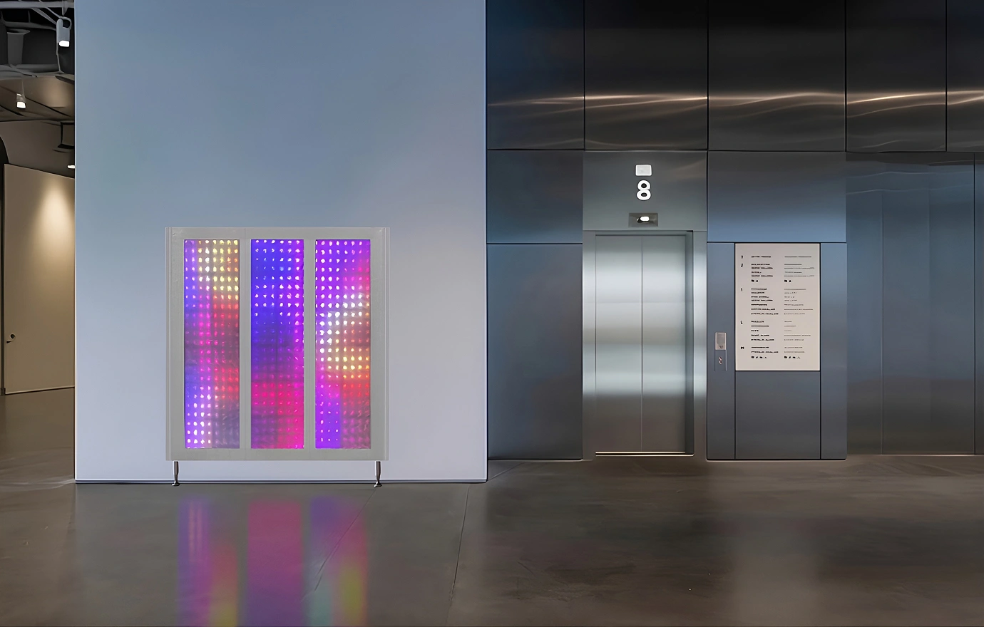
Living Colors holds this quality in its design: calm palettes, steady pacing, and flowing movement that invites without placing demands on the viewer. The result is a visual field the mind can rest with rather than work against.
Biophilic Resonance
Human perception responds differently to organic cadence than to mechanically rigid motion. Through abstract light patterns and non-linear rhythms inspired by the natural world, Living Colors introduces a subtle sense of that familiarity into professional interiors.
Far from static, the curated LED sequences introduce a quiet sense of movement that feels both enlivening and soothing.
Responsive Presence
Through proximity sensors, Living Colors creates an exchange with the people in the room — inviting curiosity, participation, and a sense of agency in new possibilities.
Over time, this changes how the environment is experienced — not as backdrop, but as participant.
The effect is collective: even passersby become part of the experience rather than separate from it.
This work draws on established frameworks like attention restoration and neuroaesthetics — and aligns with recent Oxford and MIT research on how workplace mood shapes performance (Bellet et al., 2024).
Living Colors operates as architecture, not as clinical intervention.
Our design ethos respects human physiology. The system is offered as scalable infrastructure — for enterprise settings where the quality of space affects how people stay engaged.